The importance of corporate logos stems directly to the overall identity of a company. The logo is not only the first thing consumers often recognise, but also the one aspect that is embedded into their memory.
When someone is asked about a company, the first thing they envision is the corporate logo. Therefore, the function of a logo is of complete importance when being designed to present the key corporate traits accurately. This presentation can be effectively communicated through several design principles.
As stated on page 56 in Communication Skills for Business Professionals (2018), these channel types include shape, line, colour, images and symbols. The combination of these elements is what gives corporate logos such a defined and reflected image.
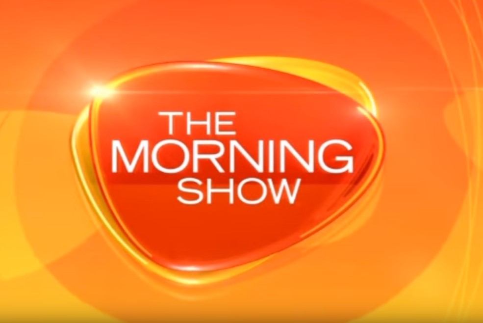
An example of this is the logo for the Morning Show (7 News, 2019). The first of which is the value of shape. The shaping in this logo follows an outlined shape likewise to a pebble. This could be interpreted in relation to tranquillity. In terms of colouring, the varying shades of red, orange and yellow are overlayed with a light glare, alongside several layers of blooming effects. Furthermore, the combination of these elements represent the appearance of a sunrise.
The lines used to assist in conveying these elements are curved and smooth, which reflects the calm transition into the morning news; nothing too sudden and bold for the viewers while they wake up. In terms of text, “The Morning Show” title in white, clear and contemporary fonts.
Similar to the other aspects of the logo, the simplicity of the text allows for an easy read for the first thing in the morning. The logo as a whole is nothing too complex, and the combination of the previously listed elements helps communicate the fresh values and informative assets of the company.
Another example of this visual communication is the Microsoft corporate logo (Microsoft, 2019). The image consists of four basic shapes, humorously resembling a window; this is due to their most popular product being the Microsoft Windows software. It can easily be interpreted into many shapes due to its simplicity.
An example of this is how the squares could also be interpreted as resembling computer monitor screens. In terms of colouring, the logo is built on primary colours, in addition to implementing grey colouring to its text. Similar to the Morning Show logo, this allows viewers to focus on the image instead of the text. This possibly intends to communicate the company’s focus on their product rather than their own identity.
The use of line in this image is simple and defined; there is no shading or blended tips to communicate depth. The entire logo conveys a contemporary finish. This reflects their products as being the basis and foundation for computing software and hardware.
References
Cenere, P., Gill, R., Lawson, C. & Lewis, M. (2018). Communication skills for business professionals. Port Melbourne, Victoria: Cambridge University Press.
7 News. (2019). The Morning Show. Retrieved from https://7news.com.au/the-morning-show
Microsoft. (2019) Official Home Site. Retrieved from https://www.microsoft.com
